
A new web look comes to nps.gov sites for National Park Week/NPS.gov
Dramatic photos, larger graphics, a simpler approach to navigation, and a somewhat laissez-faire approach to content has debuted on websites across the National Park System, with the bold, colorful look celebrating the National Park Service centennial this year.
While the new look actually was quietly rolled out in late-March, and is being formally introduced to the public this week, physical limitations -- specifically, a lack of full-time webmeisters at the park level -- prevent the engineering that went into the makeover to function at its full capacity, says Tim Cash, the National Park Service's chief of digital strategy.
The overhaul of nps.gov sites outwardly is seen through the brighter look of web pages and the centennial branding.
"There’s a lot of major work done, and being done, on the back end to improve the trip planning experience on the sites," Mr. Cash said. “Not only improve the experience, but make our data that we collect from the parks structured so that we can actually share it by API (application program interface) to third parties. And so there’s a whole lot of back end work going on, some of it is not visible yet."
For example, he explained, a lot of data needs to be produced at the park level for the software to generate user-friendly information, such as maps that show campground and visitor center locations, estimated times it will take to travel across some of the larger parks in the system, such as Yellowstone National Park.
"As we collect the data we can roll out new functionality that allows really a much more geographic experience, especially in those larger Western parks," Mr. Cash said during a phone call last week. “I always think of Yellowstone, of course, because it can be a couple of hours getting from one district in Yellowstone to another. I don’t think a lot of visitors realize that without a visual cue."
Through an internal tagging system, the new design will make it easier for parks to, essentially, tell stories through their websites.
"There are a lot of great stories that sometimes are tucked away and there are ways, visually, to connect that information so that if you’re interested in really broad, sweeping things like westward expansion or Civil Rights or World War II or women’s rights, through tagging I can bring all that information together" and present it to the reader, said Mr. Cash, and so "hopefully make a connection with the park and the American stories that we tell, that matters to you not just because it was Yosemite, or it was Statue of Liberty, but maybe there’s another way that you’re interested in connecting with our stories."
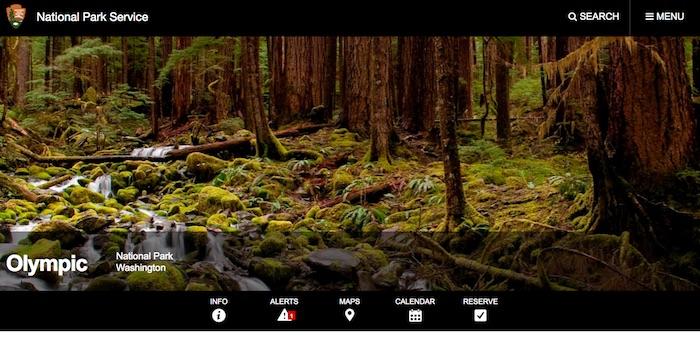
Along with the bolder look to the park websites, the makeover reduced from about 10 to three the number of navigation buttons to help readers plan their trips. In the upper right-hand corner of each park homepage is a "Menu" button that, once clicked, offers three dropdowns: Plan Your Visit, Learn About the Park, Get Involved. To the right of each of those are arrows that, once clicked, provide a dropdown list of links, such as Places To Go, Things To Do, History, Nature, etc.


Fewer main navigation buttons lead to a wealth of park information/nps.gov
Beyond that, a specific park can modify the menu bar as it feels is appropriate. For example, the Yellowstone homepage offers a "Reserve" button that takes you to a page with links to lodging concessionaires, opening and closing dates of facilities in the park, even permit information for fishing, boating, camping, weddings, and even the spreading of cremains. Many other park sites have done the same.
And they all the websites are "responsive," meaning they'll format correctly to the device you're viewing the sites on, Mr. Cash said.
But the Achilles heel of the makeover of the sites is the sheer amount of webpages that exist -- over 100,000 across the nps.gov system, according to Mr. Cash -- and the lack of staffing at the park level to manage this information, whether that means updating it or presenting it in a more logical and easier-to-find fashion.
“About the best that we can do is give (the parks) the container and editorial guidance. But each one of the parks is responsible for managing their site. Clearly, when you do that you get a pretty varied experience, and a pretty varied quality of content," said Mr. Cash, who added that NPS management is aware about that problem.
"There have been conversations about what we can do to help parks. It is almost a matter of sheer volume. It’s difficult to give them the amount of resources that are needed to manage a site this size," he said. "We do try to encourage folks to be pretty strategic in their application of resources for digital. I’m constantly reminding people, 'Don’t create something that needs care and feeding if you don’t have the resources to care for it and feed it. Make it as evergreen as you possible can.'
"And that’s limiting and I think for all of us a little frustrating because we have such strong passion for the parks and the people that come there, the work that we do along with our partners. You do the best you can with the resources you got.”
Once the data catches up with the background functionality, though, the reader benefits will be significant, said Mr. Cash. Users will be able to create itineraries for what they want to do and see once they get to a park, he said.
"If you are going to a major destination park and you’re going to be there for several days, I think we want to try to give you the ability to try to create an itinerary as best that you can and understand what you’re getting yourself into," Mr. Cash said. “I’m probably most excited about what we can potentially do, now that we’ve restructured the site, because once we get that data in place, then we can add some exciting functionality. So, it’s almost a hurry-up-and-wait right now for me.”


Comments
To many dead links and outdated info.
Many promises here for creating a first class site but without funding and supportive management it will never happen. The National Park Service is a first class organization with a third class web site. The American people and the parks deserve a better site at least one without broken links and out of date information. I give the current site a grade of D minus at best but I do support the efforts of dedicated employees to improve the site. Too bad current management does not see the importance of this work.